Thursday, January 5, 2012


Evaluation Task One
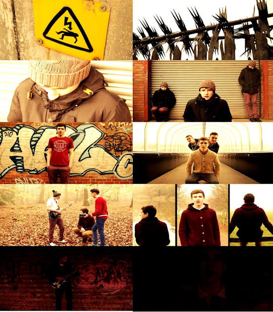
Above is a moodboard that I have created from selecting screen shots from our final production.
Song Title
The name of our song was already decided by the actual artist and it inspired us with the whole story line of a tramp wishing he had it all, without this title and lyrics it may have been hard for the audience to understand the story line. We never considered changing the song name for a few reasons; The main reason was because the lyrics 'Do You Want It All' were said constantly throughout the song which indicates the importance of these words and the song title. Another reason was because the original song is quite popular which means that when people see that there is a music video for it, they will watch it in contrast to a different name where they would not recognise the song and therefore not watch the music video.
Setting and Location
The various locations that we used throughout our music video were well suited for the image that we were trying to portray to the viewers. The song 'Do You Want It All' made it easy for us to come up with the idea of showing a tramp at the beginning which is the opposite of 'having it all'. This meant that we had to find a suitable location to suit this image of a rough, run down area so we decided upon mixing various shots from an industrial estate with shots from signs that indicate danger, as shown in the first screenshot.

The tone of the song can be perceived in a number of ways, we decided to try to put across the idea of a tramp who wishes he has it all, and then showing the character's life improving which makes the audience believe that he does, until the end with the dull mood and the candle being blown out. This meant the location choice was important to give across a certain mood and the opening shots helped us to introduce the run down scene well. Throughout, the mood which we wanted to portray was created through the setting choice.
Costumes and Props
 Choosing appropriate costumes was a very important aspect to create an effective music video if we wanted to give across the right image. We had to make it clear that the character was a tramp at the start and we accomplished this by using a large black coat, a woolly hat, ripped gloves with a scruffy outfit and appearance. We also decided to use cardboard as a prop to exaggerate the characters desperation. To ensure clarity that the mood had changed, we then decided that all the actors should wear normal clothes for the rest of the scenes such as tshirts, jeans, chinos and knitted jumpers. It was important to try our best to dress as we feel that the band would to try to suit both the video and the music genre as a whole to please our target audience.
In our early stage of planning, we were going to use a variety of props such as money, phones, cigarettes, drugs and a watch but after adapting our ideas we realised that we no longer required many prop as the focus was on the character. Despite this we did use guitars in the shots where the band we playing and walking because after researching music videos, it seemed that the most effective ones have shots of the instruments that you can hear in the song. We do feel that we could have used more props to emphasise our ideas more so that it was easier for the audience to understand any messages.
Camera work and Editing
 The quality of the camera work was also an important aspect in creating a good quality music video. We planned to use a wide range of shots and movements to create the most effective video possible and feel that we did use a good amount. To add interest into the film, certain shots were handheld and shaky, such as the establishing shots and shots of the scenery (spiders web, mushroom and twigs) which was successful and looked professional. We also tried to include pan shots such as on the bridge when the band walk past and panning across the band near the end of the film. The shot on the bridge looks very smooth but the shot in the dark barn looks more unprofessional as the speed changes causing the band to blur a little bit, although it is dark and it is hardly noticeable.
We also used still shots which were good in creating a professional looking film, and close ups of the instruments to put the attention onto the band playing which we feel was quite effective. When the screen splits into 3 and the character is walking towards the camera, although it is not smooth it looks good as it is more natural and fits with the mood and surroundings well. We were lucky to be using a high quality camera which made all shots clearer, making it easier to create a professional looking music video.
The editing of the video was time consuming due to all of the footage that we recorded. Alex has had experience editing so we were confident to try various shots with the camera that may have otherwise not been possible. An example of this is the tramp scene where he is singing in the middle while he is also on the left and right which we feel really puts across the image that he had been there for a while and his life is not desirable. The editing also meant that we could brighten up certain parts and darken parts of the film, again to emphasise what we were trying to put across, such as the last scene where it is dark and then fades out, showing how he doesn't have it all which is a total contrast to the middle of the video where it seems bright and the mood is quite happy. Without the editing it would have been hard to put this across.
Despite this, we did have some difficulties with the editing as it took a lot of time to ensure that the lip syncing looked good as though the character was actually singing the lyrics. We found that when the video is viewed in lower quality, or with a bad connection that the lip syncing can look a little out, which is out of our control but was frustrating as we tried to portray a professional looking production. Because Alex edited parts as we went along, it was an advantage because he told us exactly what needed to be filmed to ensure that we had the right footage to fill the space and create a full length video meaning that we could organise ourselves well.
Title font and style
We decided against having text at any part of the video because we watched other 'Two Door Cinema Club' videos such as the music video for 'Something Good Can Work' which had no text throughout the video. We also watched other artists within the same genre such as 'The Wombats' and 'Bombay Bicycle Club' and came to the conclusion that text may just be a distraction. Instead, we planned on creating words within the film, such as made from leaves or chips on a plate but when we tried this, it was not as effective as we first thought.
After looking at other groups films, we now feel that the video may have looked even more professional if we had the song title and artist name written on the screen at the very beginning over the top of an establishing shot which would have allowed viewers to know exactly what they are watching. The text that we feel would be most appropriate is the same font used in the digipak to ensure continuation of a theme throughout so the band is easily recognisable. Also, we feel that the font used on the digipak is effective and looks professional.
Storyline/Tone of the video and how the opening suggests it
 The video begins with an opening shot of barbed wire, followed by a handheld shot of a 'Danger of death' sign and a pan of a security fence. This instantly gives across the impression of a bad area to the viewer which is then reinforced by the shots of the tramp waking up. We wanted to create a bad tone at the start and make the tramp appear lonely and at danger, representing the opposite of 'Having it all'. The tone of the opening scene is the opposite to the majority of the music video which is what we wanted to create, doing this by choice of clothing and scenery in the opening scene.
Genre and how the opening suggests it
 Most music videos within the genre focus on the band playing throughout, rather than trying to focus on the storyline but because we focused instead on the story (Tramp scene) it does not suggest the genre to the viewer very much. This could be seen as a bad thing because it does not meet what the audience are expecting and they may dislike this, or it may be more interesting for them to watch because it is unexpected. The opening could be seen to fit a different genre such as dubstep where the whole film is based around a deprived area. Despite this, the storyline becomes clear and the whole film is not based around the same image as the first few shots which we feel created a successful music video. Within 21 seconds the mood has changed and the tramp scene has finished as the song becomes more upbeat.
Tuesday, December 13, 2011
Editing Diary
 The two main programs that I am using to edit the music video is Adobe After Effects CS5 and Sony Vegas Pro 10. Both these softwares are used at proffessional level which means that we can produce the best possible music video with the equiptment that we have.
Adobe After Effects CS5 enables me to create ground breaking motion graphics and blockbuster visual effects which will improve the overall look of our music video. The editing is going to be kept simple though as the band that we are using are retro so by using high tech motion graphics would make the whole video unrealistic. The colour grading/colour correction will be vintage style which enhance the overall retro theme of the music video.
The final video will be rendered in 720p at 24fps as that is what the camera films in.This will assure that we get the best possible quality out of the camera which will make our music video look a lot sharper. The finished thriller will be 1280x720 and will be uploaded to both youtube and vimeo.
Wednesday, December 7, 2011
Ancillary Task - Analysis Of Final Magazine Design

This is our final design for the magazine advert that will be featured in NME Magazine. By implementing a specific concept, this allowed us to expand our ideas and create an advert that fits well with our genre, the existing band and the song we have chosen to make a music video for.
The basic idea was developed from 'Two Door Cinema Clubs' album cover, which is the cat. We discussed how we were going to include a cat on the advert and came to the conclusion of having a cat flipped over and put next to the original image. By doing this, it almost looks as though there is a doorway in the middle of the cats paws. This co-insides with the artists name 'Two Door Cinema Club' - Two cats, with a door in the middle of the picture.

Finally, the logos we placed onto the advert make it look authentic. We put the bands record label onto the design in order to promote the label and the other artists associated with them. 'HMV' is there to show where the single can be purchased. The website is there to promote the band online. Consumers are able to visit the bands website in order to stay in contact with them, stay up to date with band news and find out where tickets are available to buy for their gigs.
Subscribe to:
Posts (Atom)