Showing posts with label Alex Cirino. Show all posts

Tuesday, December 13, 2011

Editing Diary

The two main programs that I am using to edit the music video is Adobe After Effects CS5 and Sony Vegas Pro 10. Both these softwares are used at proffessional level which means that we can produce the best possible music video with the equiptment that we have.

Adobe After Effects CS5 enables me to create ground breaking motion graphics and blockbuster visual effects which will improve the overall look of our music video. The editing is going to be kept simple though as the band that we are using are retro so by using high tech motion graphics would make the whole video unrealistic. The colour grading/colour correction will be vintage style which enhance the overall retro theme of the music video.
Sony vegas allows the clips to be cut down and put together in a simple and straightforward way. The timeline enables clips to be viewed before they have been rendered. The music video will be put together in this program and then transfered into After Effects for the advanced editing.

The final video will be rendered in 720p at 24fps as that is what the camera films in.This will assure that we get the best possible quality out of the camera which will make our music video look a lot sharper. The finished thriller will be 1280x720 and will be uploaded to both youtube and vimeo.

Tuesday, December 6, 2011

Ancillary Task - Digipak Analysis

A digipak is a way of distributing and packaging a bands CD. Here we have two examples from Arctic Monkeys and Kasabian.

 The Arctic Monkey's digipak is simple and they have designed it so that it is not complex. The digipak includes the CD and a booklet which contains lyrics, photographs and liner notes. The same theme is kept throughout and it creates a brand image for the band. The colours of the digipak is in someway related to the sound of the CD, as the album sounds quite stripped back which has influences from the place which it was recorded, the desert. The digipak looks rusty and sandy which also fits the theme of the band. 

The album 'West Ryder Pauper Lunatic Asylum' is the third from UK rock group Kasabian. It is a concept album based around the characters of the asylum, each song has has different theme which represents the characters. This theme is continued in this deluxe version of the album, as within the liner notes there is artwork which relates to this theme. The album has two discs, one a Cd, the other a DVD of bonus features and live performances. They are at either end of the digipak, and it is set out as a book. It is an effective digipak as it keeps a recurring theme throughout and has a high quality design.

Friday, December 2, 2011

Ancillary Task - Magazine Advert Concepts


Here are some concept ideas for the magazine adverts that will be featured in NME magazine. We liked the idea of including a cat in our designs because the actual two door cinema club album cover has a cat on it so it inspired us. The main aim when designing the advert was to make it high quality and something that everyone would remember. The cat would be recognised by a wide audience. From the concept ideas I will be able to design an improved final design which would both be creative and would market the single in a successful way.

The concepts use a retro colour correction to make them fit in with the band's style. This is good because if the colours were normal then our whole idea would not be believable. The font that we have chosen to use is 'Bebas' as it is bold and stands out.

I am going to develop these concepts to create an advert that matches our digipak and promotes the single in a aesthetically pleasing way.

Thursday, December 1, 2011

Ancillary Task - Digipak Concepts


Here are some quick concept ideas that I designed for our digipak. We chose to create a six sided digipak because we believed that we would only need six sides to promote the limited edition single.
The main aim when designing these concepts were to use imagery that linked to the band and a retro time period. From the concepts I can take the ideas which as a group we have decided that are good and make a good final design which promotes the limited edition single in a creative way.


The concepts use retro images such as a photo of Camden Town tube logo as it is a retro location. All the images have a vintage colour tone which makes it more believable that it is being filmed in a retro time period. The font that we have chosen is called 'Bebas' its a bold font which stands out and is easily readable from a distance. For each concept we tried to use imagery from one location so our intended audience can see and understand each location fully. We decided as a team that the forest and field location was the best as we got the most effective photos are shots taken there.

I am going to develop these designs further and come up with a final design which is both aesthetically pleasing and promotes two door cinema club in an effective way.


Monday, November 21, 2011

Ancillary Task - Digipak Template


Here are some template ideas that we have decided on. All of them are different and fold up in different ways. The digipak template is really important because if its not the right style for our genre of music then the whole digipak design will be affected.

We will have to make the digipak appeal to our target audience. This will be achievable if we analyse other artists DigiPak's that fall under the same genre.

The first DigiPak template is a 6 Panel 1 CD design. By using this design we can have a variety of different panels, with different pictures; lyrics and any other information the fans want too see. We feel that this one is most suitable for our DigiPak and will base our design around this.

The middle DigiPak template is a 4 Panel 1 CD design. This is the most common DigiPak scene in the industry. As there is only 4 panels, this doesnt leave us with enough space to add any other relevant information we may need to give the fans.

The bottom DigiPak is a complicated 8 Panel 1 CD design, in which the panels can be opened out to form a long poster type image. All the information needed can be fitted onto this particular DigiPak leaving enough room for a front cover, back cover and lyrics.

Monday, November 14, 2011

Day Two Of Filming


Day One Of Filming

We needed it to be sunny and luckily we had a whole week of sun so we decided to go out and try and get some filming done. Our main objective for the day was to try and have fun whilst being filmed because our music video needed to be fun and entertaining. We set out with the camera but because we didn't storyboard well we wasn't completely sure what we were going to film so we struggled.

After a bit of a discussion we eventually decided we were going to try and film some shots at Hutton Country Park because we knew that during school times it was empty however because we came straight from school to film we did not really have appropriate clothing on so it looked a bit cheap and silly.

We decided as a group that we wanted the main character Tom to lip sync throughout the video as we believed it would look a lot more effective.

After watching the footage back that we recorded we felt that it was not really good enough to use so we sat down as a group and fully storyboarded our music video so when we come to day two of filming it will be exactly how we want it.

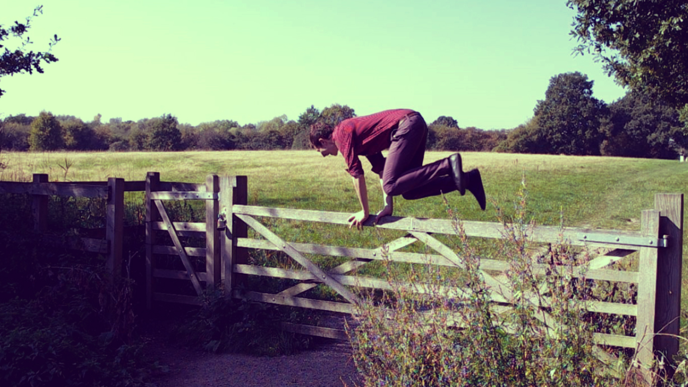
Below are some pictures from the day of filming:


Thursday, November 3, 2011

Planning Diary

The planning diary we created outlines some of the locations that we want to film our music video at. Each location has a brief descrption about what we actually want to film and the reason for choosing the location. The planning diary will help us stay organised due to the fact that it summarises what we have to do at each location however without our storyboard we wouldn't clearly know what cinematography, mise en scene and sound would be needed in each shot. We will take our plan, along with our storyboard and shooting schedule along with us when we go out filming. The plan is very easy to follow but getting to all the locations we want to film at in one day could prove to be difficult.


Monday, October 31, 2011

BARB

BARB stands for 'Broadcasters Audience Research Board'. It shows the amount of viewers that watch a certain TV program at the same time, the figures are then put into a leader board which ranks the shows from most to least watched.

The website is used mainly by advertising and media companies so they can find out which channels their adverts would be most suitable to be shown on. Companies with a large advertising budget can advertise on the most watched channels at prime time.