Thursday, January 5, 2012


Evaluation Task One
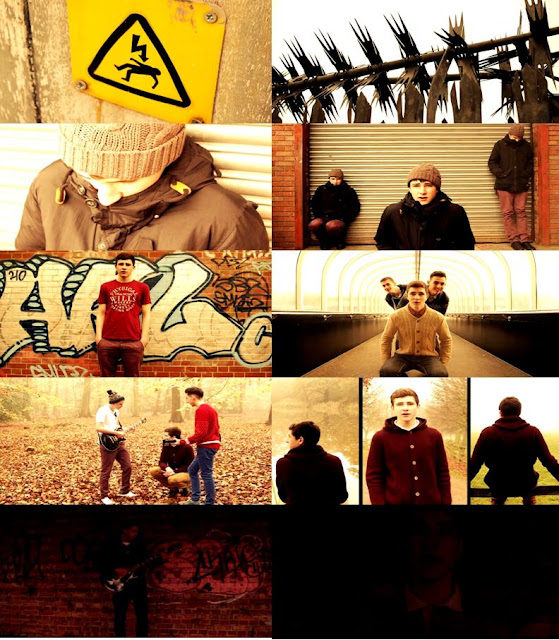
Above is a moodboard that I have created from selecting screen shots from our final production.
Song Title
The name of our song was already decided by the actual artist and it inspired us with the whole story line of a tramp wishing he had it all, without this title and lyrics it may have been hard for the audience to understand the story line. We never considered changing the song name for a few reasons; The main reason was because the lyrics 'Do You Want It All' were said constantly throughout the song which indicates the importance of these words and the song title. Another reason was because the original song is quite popular which means that when people see that there is a music video for it, they will watch it in contrast to a different name where they would not recognise the song and therefore not watch the music video.
Setting and Location
The various locations that we used throughout our music video were well suited for the image that we were trying to portray to the viewers. The song 'Do You Want It All' made it easy for us to come up with the idea of showing a tramp at the beginning which is the opposite of 'having it all'. This meant that we had to find a suitable location to suit this image of a rough, run down area so we decided upon mixing various shots from an industrial estate with shots from signs that indicate danger, as shown in the first screenshot.

The tone of the song can be perceived in a number of ways, we decided to try to put across the idea of a tramp who wishes he has it all, and then showing the character's life improving which makes the audience believe that he does, until the end with the dull mood and the candle being blown out. This meant the location choice was important to give across a certain mood and the opening shots helped us to introduce the run down scene well. Throughout, the mood which we wanted to portray was created through the setting choice.
Costumes and Props
 Choosing appropriate costumes was a very important aspect to create an effective music video if we wanted to give across the right image. We had to make it clear that the character was a tramp at the start and we accomplished this by using a large black coat, a woolly hat, ripped gloves with a scruffy outfit and appearance. We also decided to use cardboard as a prop to exaggerate the characters desperation. To ensure clarity that the mood had changed, we then decided that all the actors should wear normal clothes for the rest of the scenes such as tshirts, jeans, chinos and knitted jumpers. It was important to try our best to dress as we feel that the band would to try to suit both the video and the music genre as a whole to please our target audience.
In our early stage of planning, we were going to use a variety of props such as money, phones, cigarettes, drugs and a watch but after adapting our ideas we realised that we no longer required many prop as the focus was on the character. Despite this we did use guitars in the shots where the band we playing and walking because after researching music videos, it seemed that the most effective ones have shots of the instruments that you can hear in the song. We do feel that we could have used more props to emphasise our ideas more so that it was easier for the audience to understand any messages.
Camera work and Editing
 The quality of the camera work was also an important aspect in creating a good quality music video. We planned to use a wide range of shots and movements to create the most effective video possible and feel that we did use a good amount. To add interest into the film, certain shots were handheld and shaky, such as the establishing shots and shots of the scenery (spiders web, mushroom and twigs) which was successful and looked professional. We also tried to include pan shots such as on the bridge when the band walk past and panning across the band near the end of the film. The shot on the bridge looks very smooth but the shot in the dark barn looks more unprofessional as the speed changes causing the band to blur a little bit, although it is dark and it is hardly noticeable.
We also used still shots which were good in creating a professional looking film, and close ups of the instruments to put the attention onto the band playing which we feel was quite effective. When the screen splits into 3 and the character is walking towards the camera, although it is not smooth it looks good as it is more natural and fits with the mood and surroundings well. We were lucky to be using a high quality camera which made all shots clearer, making it easier to create a professional looking music video.
The editing of the video was time consuming due to all of the footage that we recorded. Alex has had experience editing so we were confident to try various shots with the camera that may have otherwise not been possible. An example of this is the tramp scene where he is singing in the middle while he is also on the left and right which we feel really puts across the image that he had been there for a while and his life is not desirable. The editing also meant that we could brighten up certain parts and darken parts of the film, again to emphasise what we were trying to put across, such as the last scene where it is dark and then fades out, showing how he doesn't have it all which is a total contrast to the middle of the video where it seems bright and the mood is quite happy. Without the editing it would have been hard to put this across.
Despite this, we did have some difficulties with the editing as it took a lot of time to ensure that the lip syncing looked good as though the character was actually singing the lyrics. We found that when the video is viewed in lower quality, or with a bad connection that the lip syncing can look a little out, which is out of our control but was frustrating as we tried to portray a professional looking production. Because Alex edited parts as we went along, it was an advantage because he told us exactly what needed to be filmed to ensure that we had the right footage to fill the space and create a full length video meaning that we could organise ourselves well.
Title font and style
We decided against having text at any part of the video because we watched other 'Two Door Cinema Club' videos such as the music video for 'Something Good Can Work' which had no text throughout the video. We also watched other artists within the same genre such as 'The Wombats' and 'Bombay Bicycle Club' and came to the conclusion that text may just be a distraction. Instead, we planned on creating words within the film, such as made from leaves or chips on a plate but when we tried this, it was not as effective as we first thought.
After looking at other groups films, we now feel that the video may have looked even more professional if we had the song title and artist name written on the screen at the very beginning over the top of an establishing shot which would have allowed viewers to know exactly what they are watching. The text that we feel would be most appropriate is the same font used in the digipak to ensure continuation of a theme throughout so the band is easily recognisable. Also, we feel that the font used on the digipak is effective and looks professional.
Storyline/Tone of the video and how the opening suggests it
 The video begins with an opening shot of barbed wire, followed by a handheld shot of a 'Danger of death' sign and a pan of a security fence. This instantly gives across the impression of a bad area to the viewer which is then reinforced by the shots of the tramp waking up. We wanted to create a bad tone at the start and make the tramp appear lonely and at danger, representing the opposite of 'Having it all'. The tone of the opening scene is the opposite to the majority of the music video which is what we wanted to create, doing this by choice of clothing and scenery in the opening scene.
Genre and how the opening suggests it
 Most music videos within the genre focus on the band playing throughout, rather than trying to focus on the storyline but because we focused instead on the story (Tramp scene) it does not suggest the genre to the viewer very much. This could be seen as a bad thing because it does not meet what the audience are expecting and they may dislike this, or it may be more interesting for them to watch because it is unexpected. The opening could be seen to fit a different genre such as dubstep where the whole film is based around a deprived area. Despite this, the storyline becomes clear and the whole film is not based around the same image as the first few shots which we feel created a successful music video. Within 21 seconds the mood has changed and the tramp scene has finished as the song becomes more upbeat.
Tuesday, December 13, 2011
Editing Diary
 The two main programs that I am using to edit the music video is Adobe After Effects CS5 and Sony Vegas Pro 10. Both these softwares are used at proffessional level which means that we can produce the best possible music video with the equiptment that we have.
Adobe After Effects CS5 enables me to create ground breaking motion graphics and blockbuster visual effects which will improve the overall look of our music video. The editing is going to be kept simple though as the band that we are using are retro so by using high tech motion graphics would make the whole video unrealistic. The colour grading/colour correction will be vintage style which enhance the overall retro theme of the music video.
 Sony vegas allows the clips to be cut down and put together in a simple and straightforward way. The timeline enables clips to be viewed before they have been rendered. The music video will be put together in this program and then transfered into After Effects for the advanced editing.
The final video will be rendered in 720p at 24fps as that is what the camera films in.This will assure that we get the best possible quality out of the camera which will make our music video look a lot sharper. The finished thriller will be 1280x720 and will be uploaded to both youtube and vimeo.
Wednesday, December 7, 2011
Ancillary Task - Analysis Of Final Magazine Design

This is our final design for the magazine advert that will be featured in NME Magazine. By implementing a specific concept, this allowed us to expand our ideas and create an advert that fits well with our genre, the existing band and the song we have chosen to make a music video for.
The basic idea was developed from 'Two Door Cinema Clubs' album cover, which is the cat. We discussed how we were going to include a cat on the advert and came to the conclusion of having a cat flipped over and put next to the original image. By doing this, it almost looks as though there is a doorway in the middle of the cats paws. This co-insides with the artists name 'Two Door Cinema Club' - Two cats, with a door in the middle of the picture.

Finally, the logos we placed onto the advert make it look authentic. We put the bands record label onto the design in order to promote the label and the other artists associated with them. 'HMV' is there to show where the single can be purchased. The website is there to promote the band online. Consumers are able to visit the bands website in order to stay in contact with them, stay up to date with band news and find out where tickets are available to buy for their gigs.
Tuesday, December 6, 2011
Ancillary Task - Digipak Analysis
 A digipak is a way of distributing and packaging a bands CD. Here we have two examples from Arctic Monkeys and Kasabian.
 The Arctic Monkey's digipak is simple and they have designed it so that it is not complex. The digipak includes the CD and a booklet which contains lyrics, photographs and liner notes. The same theme is kept throughout and it creates a brand image for the band. The colours of the digipak is in someway related to the sound of the CD, as the album sounds quite stripped back which has influences from the place which it was recorded, the desert. The digipak looks rusty and sandy which also fits the theme of the band.
The album 'West Ryder Pauper Lunatic Asylum' is the third from UK rock group Kasabian. It is a concept album based around the characters of the asylum, each song has has different theme which represents the characters. This theme is continued in this deluxe version of the album, as within the liner notes there is artwork which relates to this theme. The album has two discs, one a Cd, the other a DVD of bonus features and live performances. They are at either end of the digipak, and it is set out as a book. It is an effective digipak as it keeps a recurring theme throughout and has a high quality design.
Sunday, December 4, 2011


Friday, December 2, 2011
Ancillary Task - Magazine Advert Development
Our advert is important in marketing our song and band, so we wanted to do extensive research to make sure our advert looked good. I brought in magazines to lesson for us as a group to go through, and get a good idea of what we wanted to do. We used the same magazine we would advertise in, to make our discussion relevant.
From looking at all the adverts in NME, we decided it would probably be best, not to do a full page advert, as there aren't many in the magazine, the only adverts in the magazine are small and normally only take up to a quarter of page. We have decided to reflect this in our advert concept ideas.

From looking at all the adverts in NME, we decided it would probably be best, not to do a full page advert, as there aren't many in the magazine, the only adverts in the magazine are small and normally only take up to a quarter of page. We have decided to reflect this in our advert concept ideas.
We have also decided to take inspiration from Two Door Cinema Club's album cover, as they also have a photo of a cat, so we have taken a photo specifically of one of ours, for the magazine advert. Below is Two Door Cinema Club's album cover.

Ancillary Task - Magazine Advert Concepts


Here are some concept ideas for the magazine adverts that will be featured in NME magazine. We liked the idea of including a cat in our designs because the actual two door cinema club album cover has a cat on it so it inspired us. The main aim when designing the advert was to make it high quality and something that everyone would remember. The cat would be recognised by a wide audience. From the concept ideas I will be able to design an improved final design which would both be creative and would market the single in a successful way.
The concepts use a retro colour correction to make them fit in with the band's style. This is good because if the colours were normal then our whole idea would not be believable. The font that we have chosen to use is 'Bebas' as it is bold and stands out.
I am going to develop these concepts to create an advert that matches our digipak and promotes the single in a aesthetically pleasing way.
Thursday, December 1, 2011
Ancillary Task - Digipak Concepts


Here are some quick concept ideas that I designed for our digipak. We chose to create a six sided digipak because we believed that we would only need six sides to promote the limited edition single.
The main aim when designing these concepts were to use imagery that linked to the band and a retro time period. From the concepts I can take the ideas which as a group we have decided that are good and make a good final design which promotes the limited edition single in a creative way.
The concepts use retro images such as a photo of Camden Town tube logo as it is a retro location. All the images have a vintage colour tone which makes it more believable that it is being filmed in a retro time period. The font that we have chosen is called 'Bebas' its a bold font which stands out and is easily readable from a distance. For each concept we tried to use imagery from one location so our intended audience can see and understand each location fully. We decided as a team that the forest and field location was the best as we got the most effective photos are shots taken there.
I am going to develop these designs further and come up with a final design which is both aesthetically pleasing and promotes two door cinema club in an effective way.
Monday, November 28, 2011
Ancillary Task - Where Would Our Advert Be Advertised?
Obviously to make our advert effective, it needs to be in right place, putting our music magazine in the wrong place means our target audience, wont be able to see the advert. This will have a profound effect on how our advert will be designed. We have decided to put our advert in NME magazine, because we pinpointed that publication as the place where our target audience was most likely to take notice of an advert.
NME was first published in 1962, and is now distributed weekly around the UK. It originally started off as a music newspaper but now has undertaken more of magazine format in recent years. NME started it's website in 1996 and has since become a successful place for web news about music.
Our target audience, which is primarily aimed at young people, both men and women. We have aimed our media product at people aged 15-20, as this will be the sort of age where people will be listening to this music, people at this sort of age would most likely be students and are normally the type of people who enjoy listening to music the most.


NME was first published in 1962, and is now distributed weekly around the UK. It originally started off as a music newspaper but now has undertaken more of magazine format in recent years. NME started it's website in 1996 and has since become a successful place for web news about music.
Our target audience, which is primarily aimed at young people, both men and women. We have aimed our media product at people aged 15-20, as this will be the sort of age where people will be listening to this music, people at this sort of age would most likely be students and are normally the type of people who enjoy listening to music the most.


Monday, November 21, 2011
Ancillary Task - Analysis Of Two Magazine Adverts
 The first magazine advert we have decided to analyse is from the band Kasabian. They are a UK rock group who since their self titled debut album in 2004, are now one of the biggest bands in Britain. This advert was taken from NME in March 2009. It was a double page spread in the centre of the magazine, this advert helped advertise their tour dates and song. This was printed a few months before their 3rd album 'West Ryder Pauper Lunatic Asylum', which charted at the top of the album charts. Firstly, discovering this was in the middle pages of NME contributed to how effective this was. Normally there are no adverts in the middle pages of NME, making this a 'one off', also this could then be pulled out and used as a poster. Having an advert right in the middle is a great place for exposure, and is almost as good as being on the front cover, as nearly everyone who reads the magazine, will go past the middle pages and see this. If you were to put this advert at the back of the magazine where similar adverts would go, you probably woud'nt get it seen as much, as not everyone reads the whole thing. Across the top the bands logo is large across the top, making it obvious who's advert it is. The picture on the right hand side is quite an iconic photo as it makes the singer look like a good front man. All the tour dates on the left hand side are basically an advert in its self, as when people see how many dates they are playing in big venues like Brixton Academy, people who may not have known the band will see that they are actually a very successful band. The advert also promotes the bands new single, and the forthcoming album.
 The second advert i chose to analyse is one by The Stone Roses, this advert is promoting the re release of the bands debut classic 'The Stone Roses'. The album is considered to be one of the best of all time, and also believed to be a near perfect album. This 20th anniversary special is the original album with demo's and rarities included. The album originally came out in 1989 and in 2009, the album was remastered and re packaged, and was advertised in all types of music magazines. It obviously worked well, as the album reached number 5 on its re release. This advert fits in with the general colour scheme of the album, with blue, red and white being some of the main colours on the cover. It uses the bands font, and incorporates the band's logo, the lemon, which also features on the original album cover. The advert then has plenty of quotes around the outside braising the album, with the best, by NME, at the top and the biggest in the front. Just like we plan to do in our magazine advert, they have used a HMV logo in the bottom right hand corner, to show where you can buy it, and the label that the band released the album on in 1989. This advert can be very effective as the quotes used praise the album, which then makes people want to listen to the album, to see if it matches their expectations of it.
 Both adverts are very simple, with a minimalistic approach to design with only a few quotes, we will take all this into account when we design our advert for our song.
Ancillary Task - Digipak Template

Here are some template ideas that we have decided on. All of them are different and fold up in different ways. The digipak template is really important because if its not the right style for our genre of music then the whole digipak design will be affected.
We will have to make the digipak appeal to our target audience. This will be achievable if we analyse other artists DigiPak's that fall under the same genre.
The first DigiPak template is a 6 Panel 1 CD design. By using this design we can have a variety of different panels, with different pictures; lyrics and any other information the fans want too see. We feel that this one is most suitable for our DigiPak and will base our design around this.
The middle DigiPak template is a 4 Panel 1 CD design. This is the most common DigiPak scene in the industry. As there is only 4 panels, this doesnt leave us with enough space to add any other relevant information we may need to give the fans.
The bottom DigiPak is a complicated 8 Panel 1 CD design, in which the panels can be opened out to form a long poster type image. All the information needed can be fitted onto this particular DigiPak leaving enough room for a front cover, back cover and lyrics.
The first DigiPak template is a 6 Panel 1 CD design. By using this design we can have a variety of different panels, with different pictures; lyrics and any other information the fans want too see. We feel that this one is most suitable for our DigiPak and will base our design around this.
The middle DigiPak template is a 4 Panel 1 CD design. This is the most common DigiPak scene in the industry. As there is only 4 panels, this doesnt leave us with enough space to add any other relevant information we may need to give the fans.
The bottom DigiPak is a complicated 8 Panel 1 CD design, in which the panels can be opened out to form a long poster type image. All the information needed can be fitted onto this particular DigiPak leaving enough room for a front cover, back cover and lyrics.
Friday, November 18, 2011

Thursday, November 17, 2011


Ancillary Task - Magazine Advert
What is a magazine advert?
In order to promote our band, song and album, we need to advertise it as many places as possible. A good place to advertise it is in appropriate magazines, tv channels, websites, etc. For our magazine advert we have to ddesign it and also decide which publication it would go in.
We decided as our song fits under the genre of 'Indie' it would be most appropriate in a magazine like NME or maybe even Q. The reason for primarily choosing NME is that we will be ablke to reach our targe audioenmce for the song in that magazine. It's important we do that, as if we advertised our song in, for example, 'Metal Hammer', our avertisement campaign would probably not be that successful, as the readership of that magazine, would probably not listen to 'indie' music.
I will analyse other similar adverts to help gain inspiration and idea's for our advert, to make them as effective as possible.
In order to promote our band, song and album, we need to advertise it as many places as possible. A good place to advertise it is in appropriate magazines, tv channels, websites, etc. For our magazine advert we have to ddesign it and also decide which publication it would go in.
We decided as our song fits under the genre of 'Indie' it would be most appropriate in a magazine like NME or maybe even Q. The reason for primarily choosing NME is that we will be ablke to reach our targe audioenmce for the song in that magazine. It's important we do that, as if we advertised our song in, for example, 'Metal Hammer', our avertisement campaign would probably not be that successful, as the readership of that magazine, would probably not listen to 'indie' music.
I will analyse other similar adverts to help gain inspiration and idea's for our advert, to make them as effective as possible.
Monday, November 14, 2011
Ancillary Task - What is a Digipak?
A definition of a DigiPak we found is - 'An innovative approach to packaging CD-Audio, CD-ROM and DVD discs, the patented Digipak is designed as the perfect replacement to the traditional plastic jewel box. Digipak is a self-contained package that protects the disc. It is shatter proof and allows for greater graphic display and market impact'.
Digipaks can be opened like a book, where one part opens to the right, one to the left and leaving the centre part holding the CD. The pack consists of 3 parts, front cover, middle section and the back cover. Many artists who publish their CD's into the public, will use a Digipak to help promote them, whether it be with exclusive pictures inside, or information about the artists themselves.
The front cover will display the Artists/Bands name. This will help consumers recognise that it is them and will help with promoting the CD. The Artists name is usually accompanied by a picture of the artist or a graphic design feature.
The Middle section is the part of the Digipak that encases the CD. This is generally plastic that is attached to the paper/card board, which is much like the more common 'Jewel Case'. Often, Digipaks display pictures of the artists and lyrics of their songs. If they decide to include this as 'bonus' features then they would also be found in the middle of the packs.
The back cover will generally display the artists or bands song. If its an album, it will display all of the songs on the CD. Also the barcode that shops scan for purchasing, will also be found on the back cover.
Digipaks can be opened like a book, where one part opens to the right, one to the left and leaving the centre part holding the CD. The pack consists of 3 parts, front cover, middle section and the back cover. Many artists who publish their CD's into the public, will use a Digipak to help promote them, whether it be with exclusive pictures inside, or information about the artists themselves.
The front cover will display the Artists/Bands name. This will help consumers recognise that it is them and will help with promoting the CD. The Artists name is usually accompanied by a picture of the artist or a graphic design feature.
The Middle section is the part of the Digipak that encases the CD. This is generally plastic that is attached to the paper/card board, which is much like the more common 'Jewel Case'. Often, Digipaks display pictures of the artists and lyrics of their songs. If they decide to include this as 'bonus' features then they would also be found in the middle of the packs.
The back cover will generally display the artists or bands song. If its an album, it will display all of the songs on the CD. Also the barcode that shops scan for purchasing, will also be found on the back cover.
Subscribe to:
Posts (Atom)